We're in the middle of a cultural paradigm shift. We're transitioning from wanting something that's just pretty to something more emotionally relatable.
This isn't new to Architects, a lot of great architecture is designed to create an emotional impact on occupants.
Roman Catholic Cathedrals use height and clerestory lights to demonstrate an aspiration to heaven. The environment is designed to visually and spatially enforce the message being conveyed by the service.
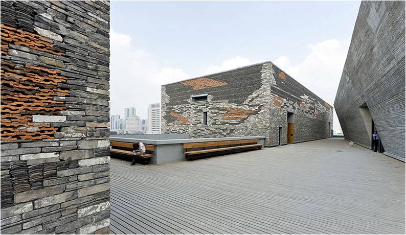
Local materials can be used as an allusion to the history of the site and surrounding areas. Wang Shu's historic museum in Ningbo integrates the past into the cladding system in a clever and informative fashion.
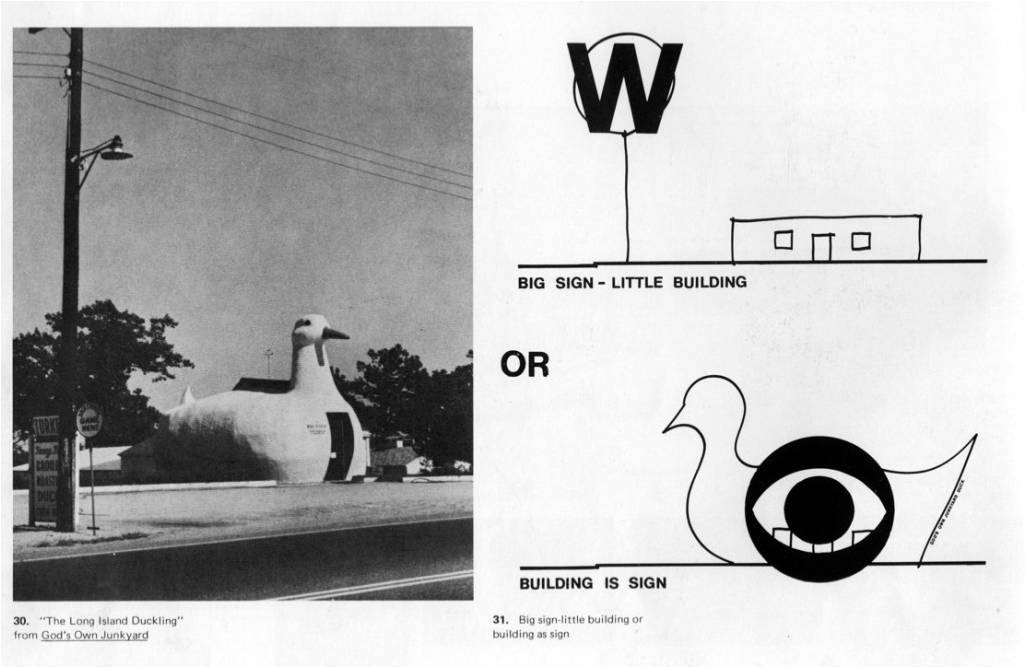
I started looking outside of architecture for opportunities in more immersive environments. Not necessarily for ideas that could be taken 1:1 and implemented verbatim, but more like a Learning from Las Vegas set up.
Venturi and Scott Brown opened up a brand new vocabulary to talk about architecture with by looking to architecture without Architects. It kind of hit me as I was playing a game, League of Legends, one night and did not realize I was being primed to have a friendlier experience.
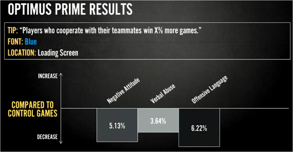
League of Legends came out in 2009 and has since gained 27 million players. It also suffers from the most toxic community for players. The set up is such that you're trapped in a game with 4 people you may or may not know and cannot leave until someone loses or surrenders first. A few years ago, Riot introduced tooltips into League of Legends at the loading sequence and set up phase.
As it turns out, that small instance was enough to impact the attitude of the players. It reduced negative chat conversations by 5%, which may seem small at first. But for millions of games played a day, it adds up.
While these are simple UI modifications, it demonstrates something interesting about the industry. A/B testing can lead to unexpected results when comparing seemingly insignificant changes. Architects could benefit from this type of data when approaching conversations about value engineering. We're seeing that players can form emotional reactions to minimal visual cues.
The gaming industry refers to affects as Immersion. Alex McDowell coined this term as "using a design to form a Relationship with the User or Audience" and is actually kind of poetic.
Modern video games are finding clever ways to use graphic and spatial design techniques to create an emotional impact on players.
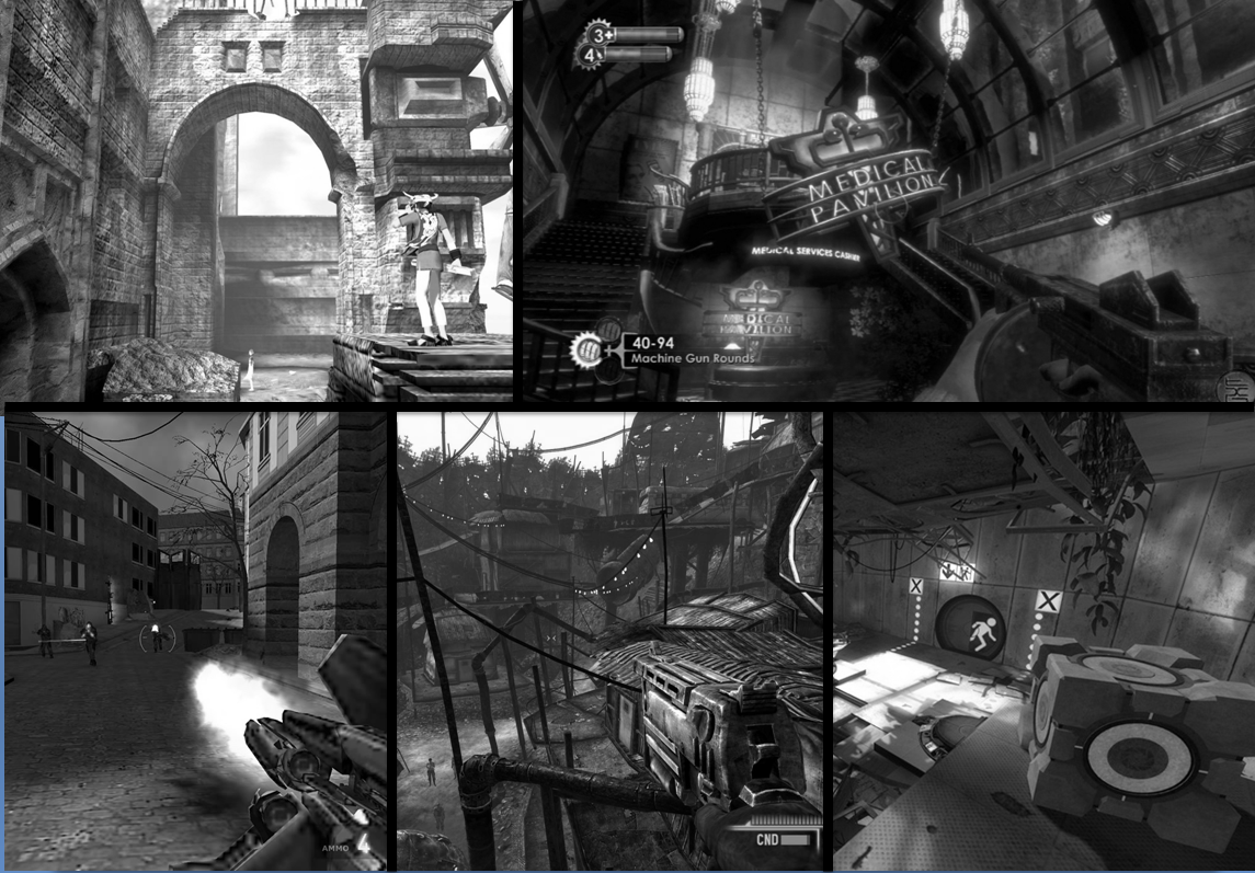
Let's look at some ground-breaking games that use spatial design as a means of connecting to the player on a subconscious level. I've seen games use scale, colors, architectural styles, layering, and narrative as architectural partis in their virtual environments.
Ico is an emotionally charged puzzle game.
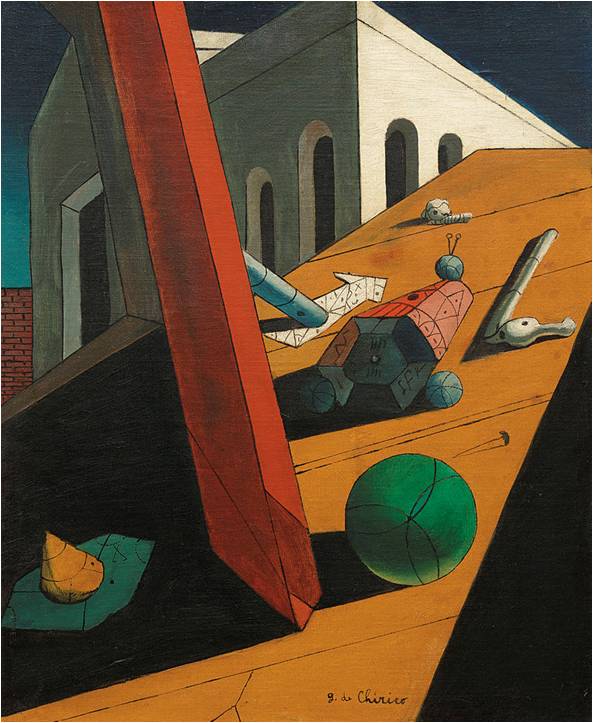
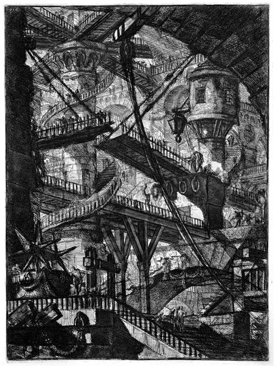
Just by looking at the box-art, we can start to see some of the subtext associated with the imagery. Unfortunately the market was not ready for this in 2001-- which happened to be the same year that Grand Theft Auto came out.
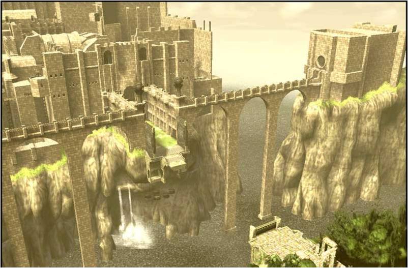
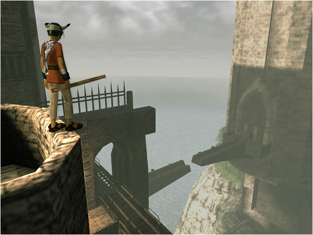
Fortunately, this game was well received by the game design community and some of its more successful features have been integrated into new games. One of the tactics which resonated with me in particular was the scale of the environment in contrast to the playable character. Your range of motions are human and result in a feeling of accomplishment when you solve puzzles.
Another interesting relationship is the sheer complexity of puzzles which reward an observant player. Solutions to problems become apparent when viewed from further away, then solved by coming in closer.
These puzzles are made possible by the fidelity between the interior and exterior of this environment. This is not always a given when it comes to virtual architecture.
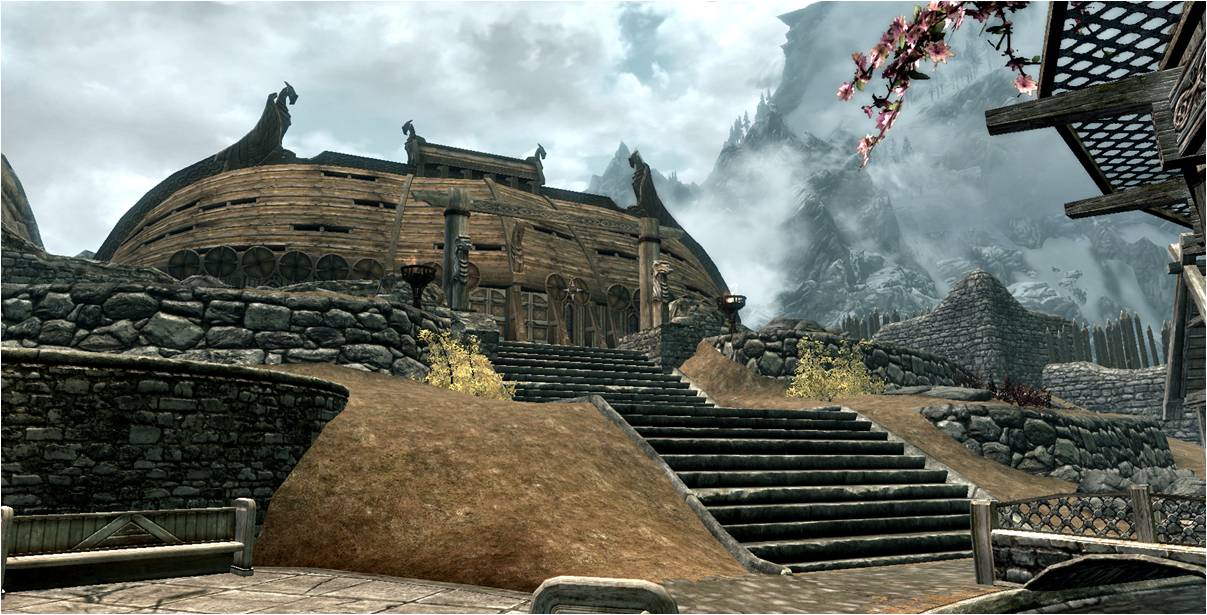
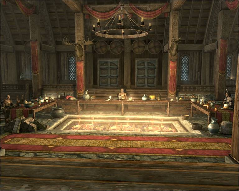
Even in big titles like Skyrim, we'll see shortcuts which cheapen design integrity. Jorvaskr is a great example of this, an upside down boat comprises the exterior, but the interior is a decorated box of a hall.
At one point in time Bethesda did care about architecture. These open world games are in fact challenging for developers to create a multitude of consistent designs which draw people in and through them in an efficient but interesting way. They have to make things seem authentic, which is challenging but can lead to great opportunities with virtual vernacular. Fallout 3 poses the reality of a nuclear apocalypse. Dialogue in the game constantly emphasizes how fragile life is in the wasteland.
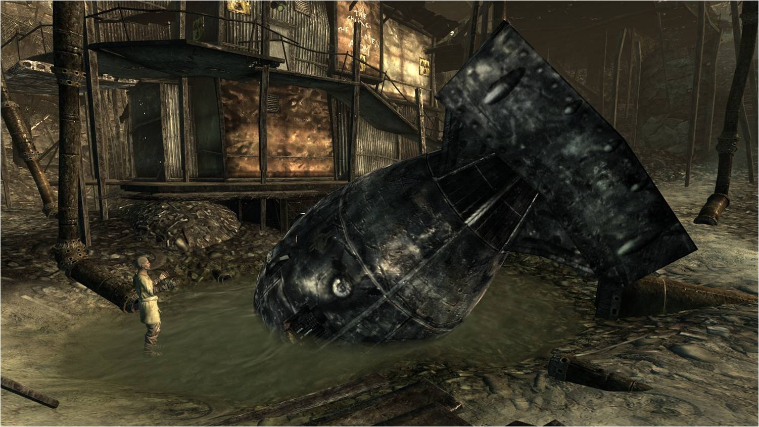
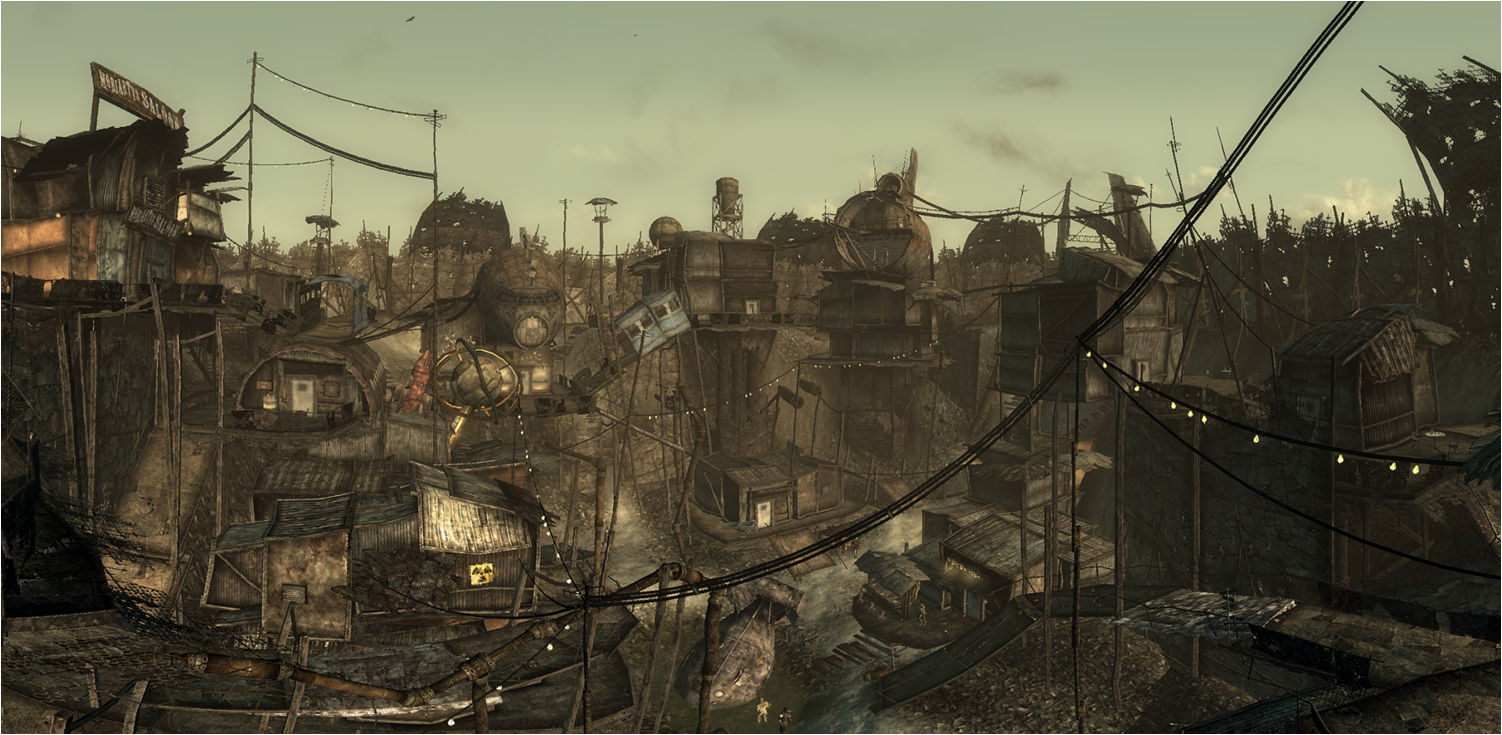
The closest settlement to the vault, your starting point, is Megaton. At this point, you may need to find a place to heal and buy more supplies, so it's a relief to find civilization. It's made out of scraps of planes and looks safe from raiders.
Literally the first thing you see inside is a bomb.
Not only is the bomb in the center of the city, houses are actually built up and around it. It's the focal point of the city and you simply can't avoid seeing it during any quest. This arrangement embodies the fine line between life and death that all of the dialogue refers to.
This continuity makes for an immersive experience which allows the player to naturally align with the views provided for the character dialogue options. Game developers are trying to customize experiences, but can only build one game. The dialogue options may vary between player to player based on playstyle, but the environment will be the same regardless.
Another instance where the environment embodies the narrative is Bioshock.
Rapture is a city under the sea built by innovators and creatives without a government to hold them back. Which is just anarchy. Anarchy is what happens when you don't have a government.
So the player catches these glimpses of futurism, art deco, and the way those two intertwine then promptly unfurl.
Without giving away too much, I'd like to talk to the championing tactic in this game-- conditioning. Players were exposed to red colors before fights or as aggressive machines or inhabitants approached.
Green was the color used to indicate friendly or "hacked" machines. These are safe to approach and can actually save you if you're running away from something.
The game developers then turn around to use this to help you navigate the level. In 4 short hours of gameplay, after the player has an understanding of these colors, we start to see the developer provide wayfinding with this tactic, or put green dresses 0n non-violent inhabitants of Rapture. This expectation can also be used to trick or emphasize the impact of a plot point.
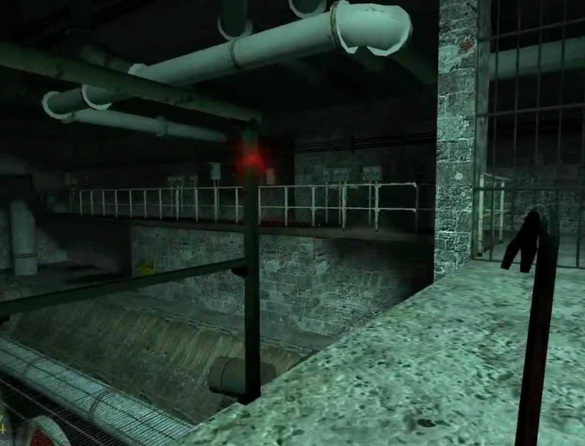
The result is a highly immersive game which does not break immersion to help the player navigate the environment. Another game which is great at this is Half-Life 2. The player learns very quickly that this game isn't a guns-blazing playstyle game.
The antagonist in HL2 is the Combine, which almost functions more like a government. This is enforced through generally safer underground or interstitial environments. And unsafe open environments. Another dichotomy posed to characterize the enemy is architectural style versus urban fabric. Early in the game we are forced to reckon with the contrast between the city and the looming Citadel.
The Wall is also polarizing to its environment. We see hard lines and sharp edges and a lack of scale. The surrounding buildings look familiar and plain, which further antagonizes the style.
Valve is pulling from intuitive human reactions. We see that the Combine architecture very much resembles the picture on the right. The picture on the right depicts a 70's design experiment with the intent of deterring accidental human interaction with buried nuclear waste. Using architecture to characterize and enemy is actually pretty common in movies, but it's often done as a caricature. It's refreshing to see an honest and impactful style which embodies a more complex antagonist.
Finally, we have my favorite use of architecture in a game. Portal 2 was made by the same folks that created HL2. There are two simple mechanics in this game.
Velocity is maintained between portals. You can only shoot portals on drywall.
Which affords the game designers the opportunity to use an unreliable narrator.
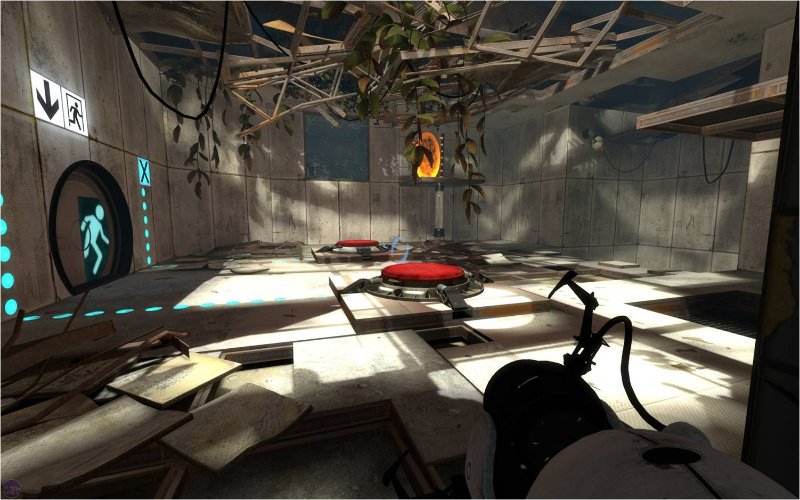
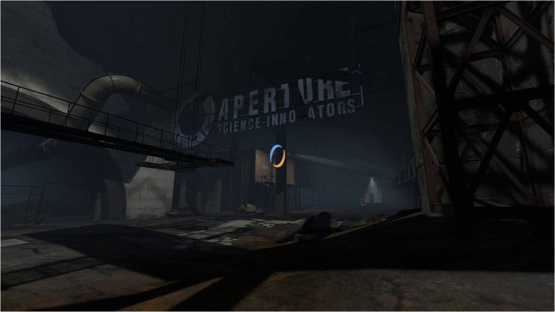
While GladOS is busy trying to deceive you, the architecture simply cannot. The facility is falling apart and revealing secrets and histories to you as you move through the test chambers and eventually break out.
At some point the architecture is the only thing guiding you through the game. This newfound narration technique is something we could learn from. Virtual Architecture presents creative solutions for architecture in atypical roles.


